PostUp Mobile App
PostUp is a mobile app designed specifically to help freelancers and remote workers find public places to “post up” and do work.
Team
Me: Solo UX/UI Designer
Tools


PostUp was created over a 5-day GV Design Sprint where I:
The Problem
Remote workers and freelancers often have to go through a hassle to find public places to complete work or have client meetings that have all the amenities they need and the proper working environment
How might we provide a mobile solution for freelancers and remote workers, allowing them to find suitable public working environments?
Day 1: Understand/Map
Organizing the Research
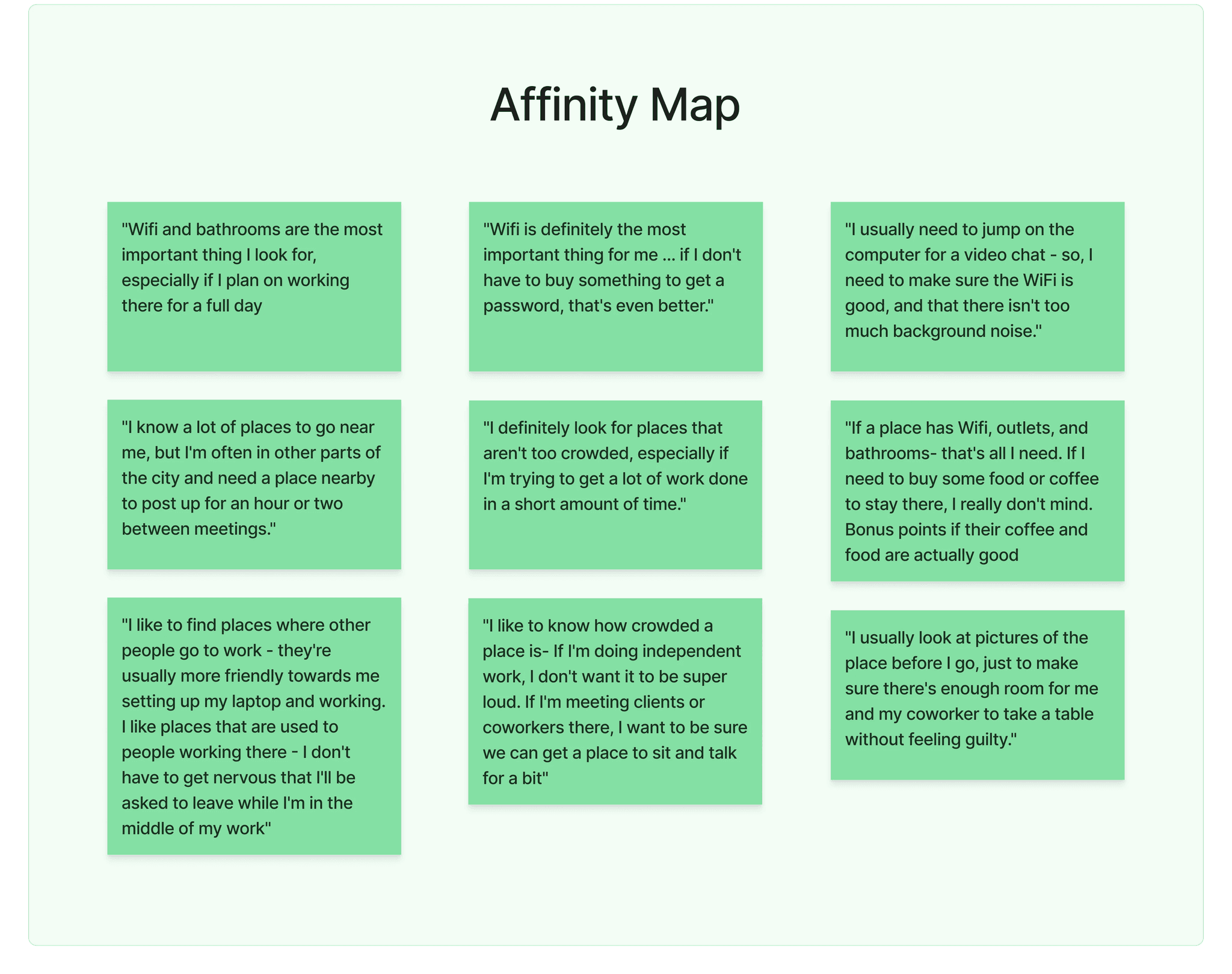
I began Day 1 by synthesizing the user research provided by the client through an affinity map to get a better picture of the issues current users were facing.
What I found:
The target audience all had similar requirements for finding their ideal work environment:
Amenities
Wifi, bathrooms, and charging outlets
Atmosphere
Call friendly, quiet, and productive
Extras
No purchase required for seating
"Wifi and bathrooms are the most important thing I look for, especially if I plan on working there for a full day."
Crafting the Persona
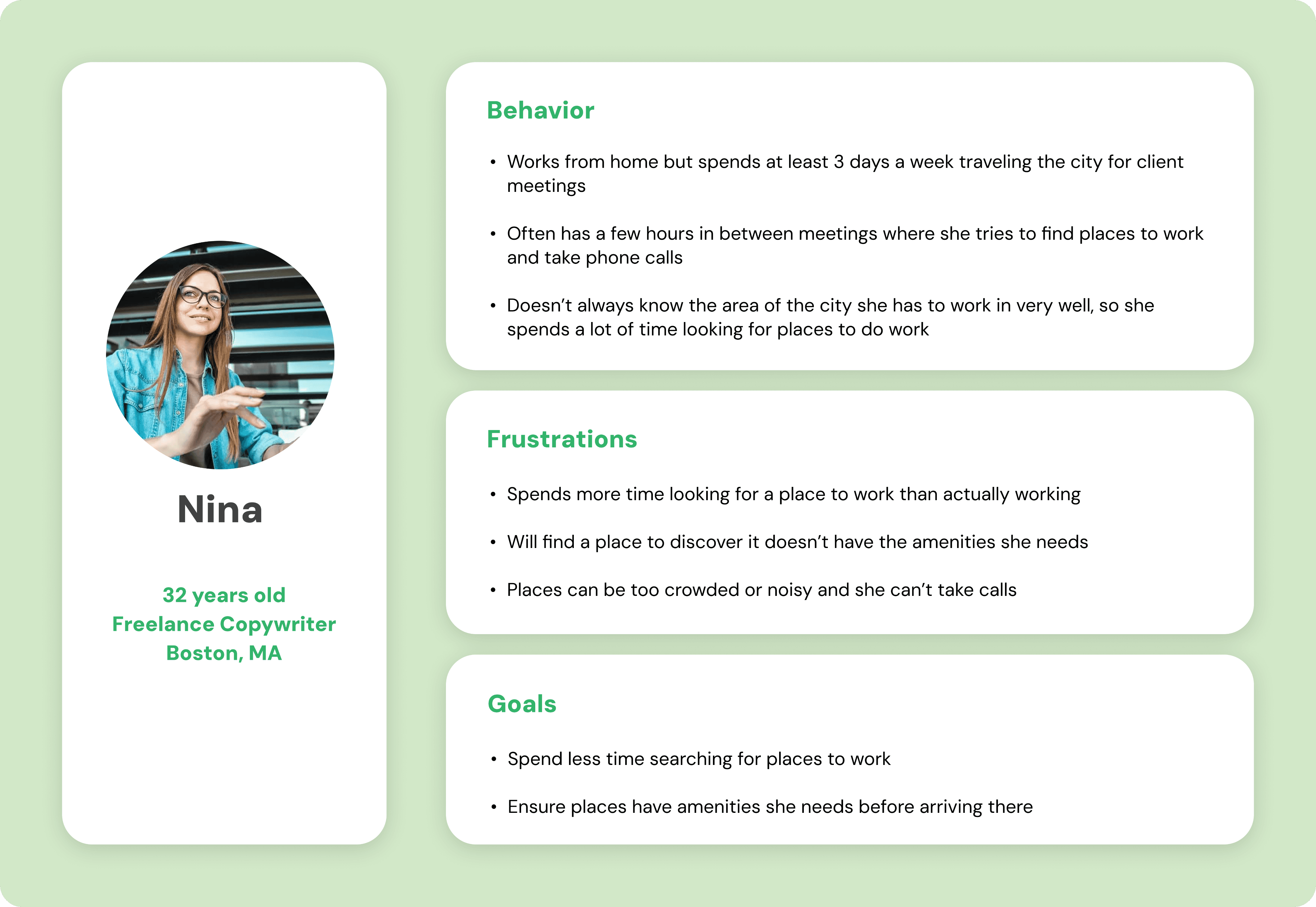
The user persona Nina, finds herself spending too much time trying to find a public place to work, just to arrive and not have the amenities or atmosphere desired.
She desires a quicker way to ensure she can find a place that has all her desired amenities before arriving there.
Additional Insights
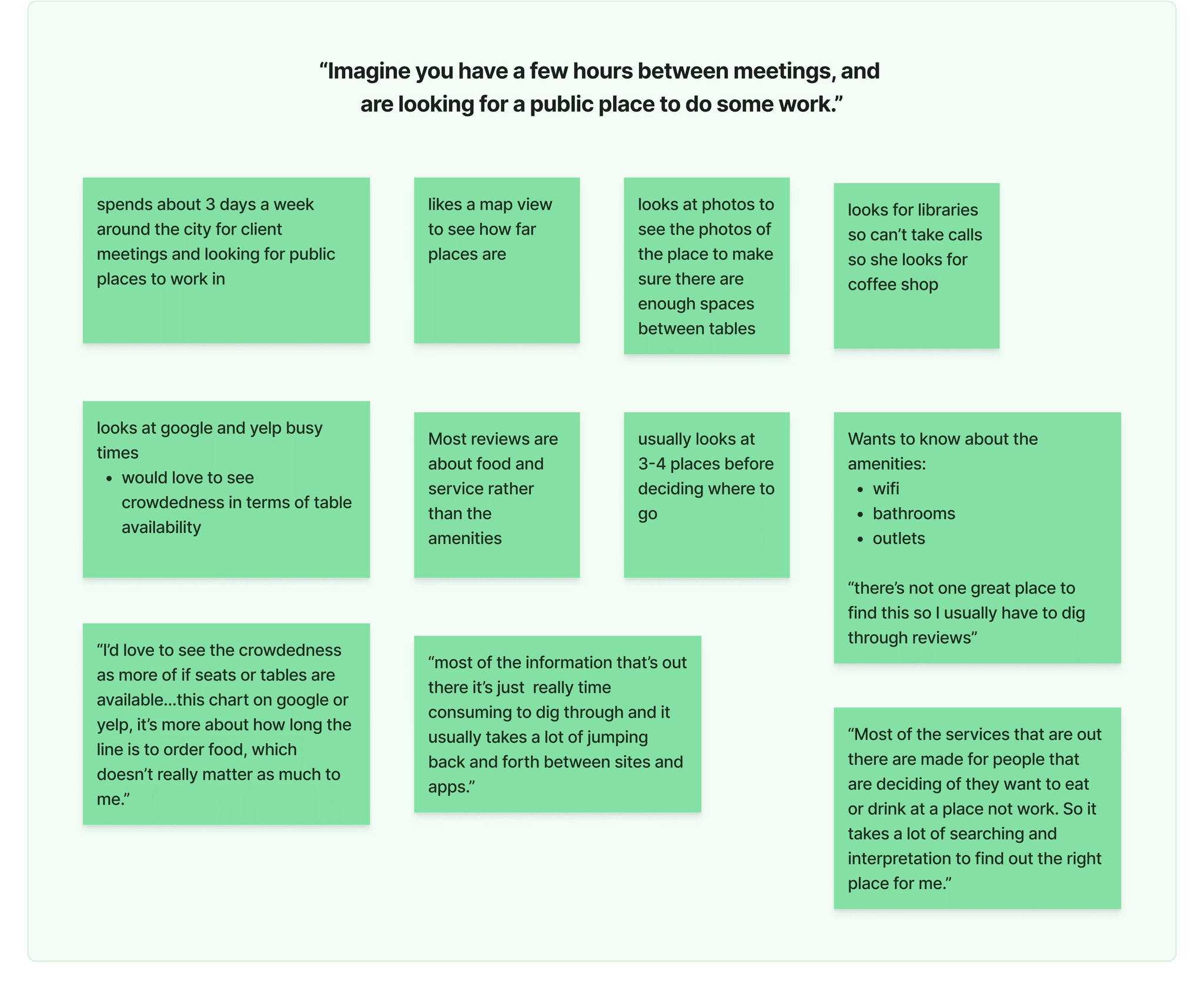
I then organized the insights from the client-provided user interview video conducted with a freelance graphic designer from New York City: Chelsea.
“Most of the services that are out there are made for people that are deciding if they want to eat or drink at a place not work. So it takes a lot of searching and interpretation to find out the right place for me.”
- Chelsea
Day 2: Sketch
Lightning Demo
I began Day 2 by doing a lightning demo to look at how current competitors have created solutions to the issues the target audience of PostUp are facing.
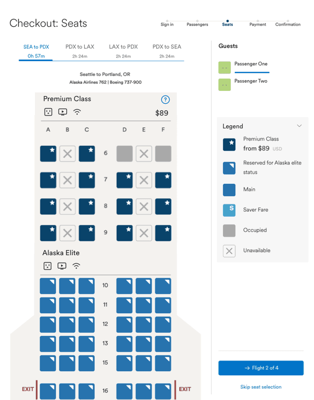
Alaska Airlines
I liked how this example clearly showcased the differences between available and unavailable seating options for seating chart inspo.
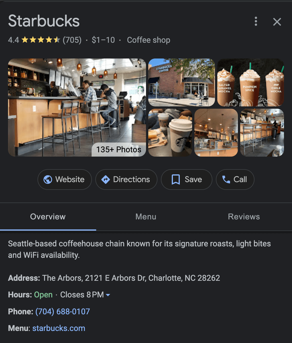
Google My Business
GMB has a lot of features that are beneficial for users (popular times, business overview, review summary, etc.) that can be tweaked to be more beneficial for target users.
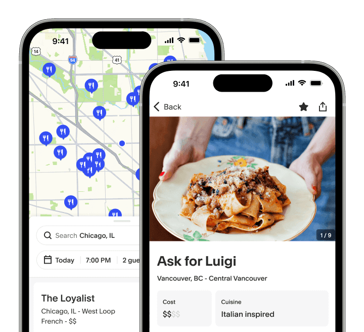
TockApp
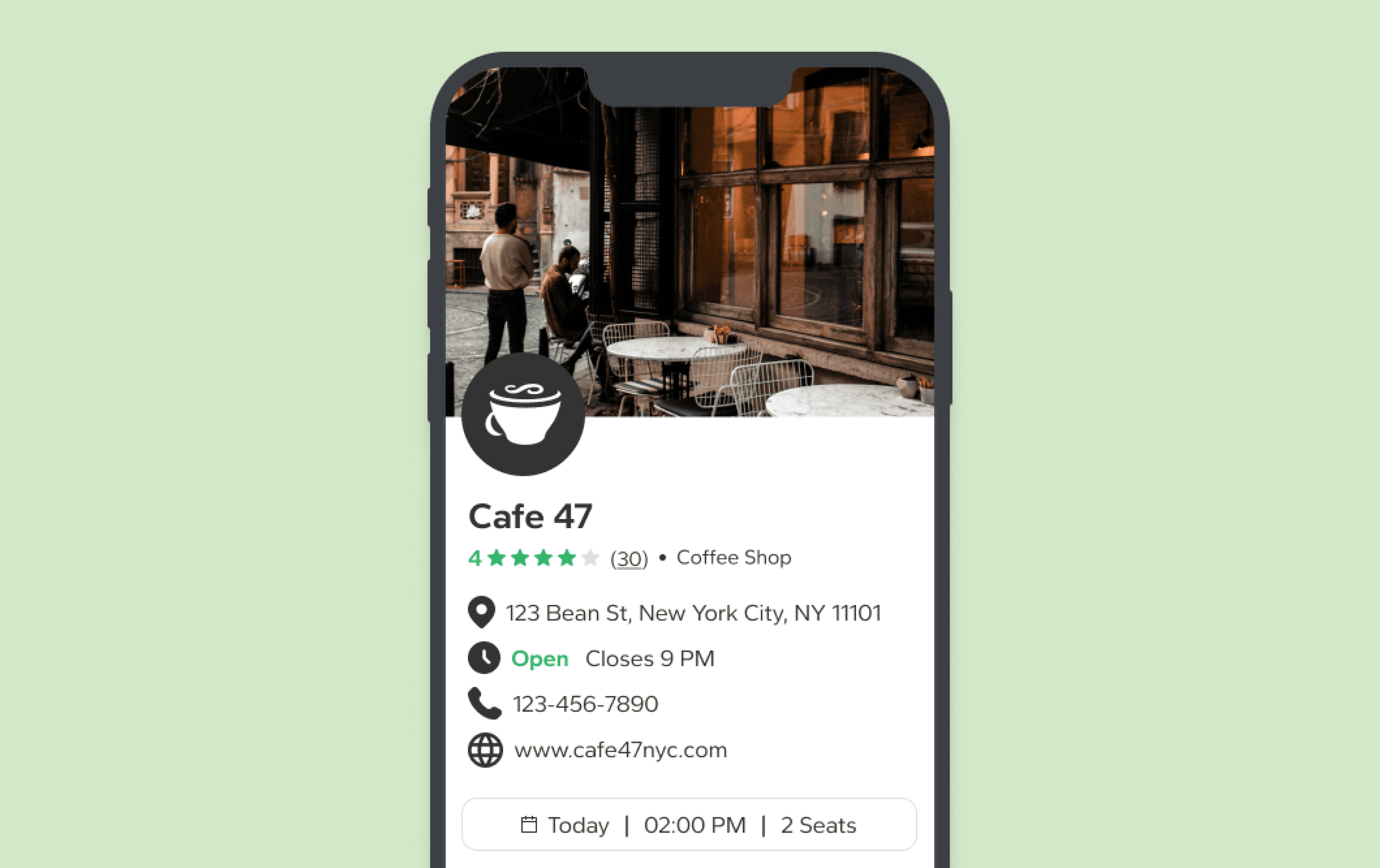
I really liked TockApp for its simple user interface and the reservation feature included on the same screen as the map.
4th ID
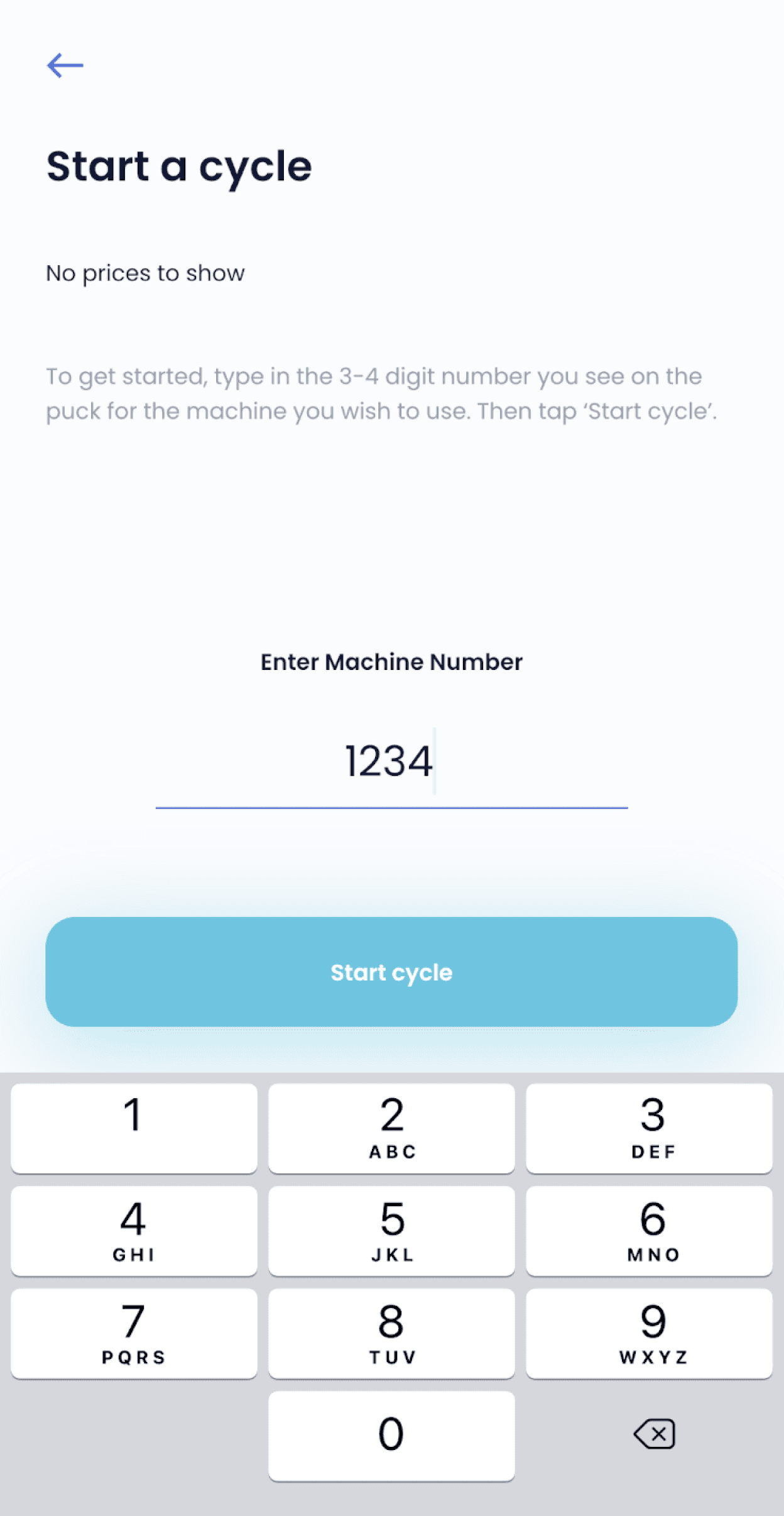
This laundry app I used in college was good inspo for developing the reservation process for PostUp.
Crazy 8's
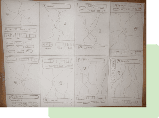
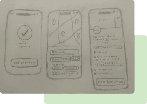
To start bringing my solution ideas to life, I did Crazy 8’s sketches for the location search screen as it would differentiate PostUp’s search process from competitors.
The Solution Sketch
I then designed the screens that would appear both before and after the location search screen screen to begin imagining the user flow.
Day 3: Decide
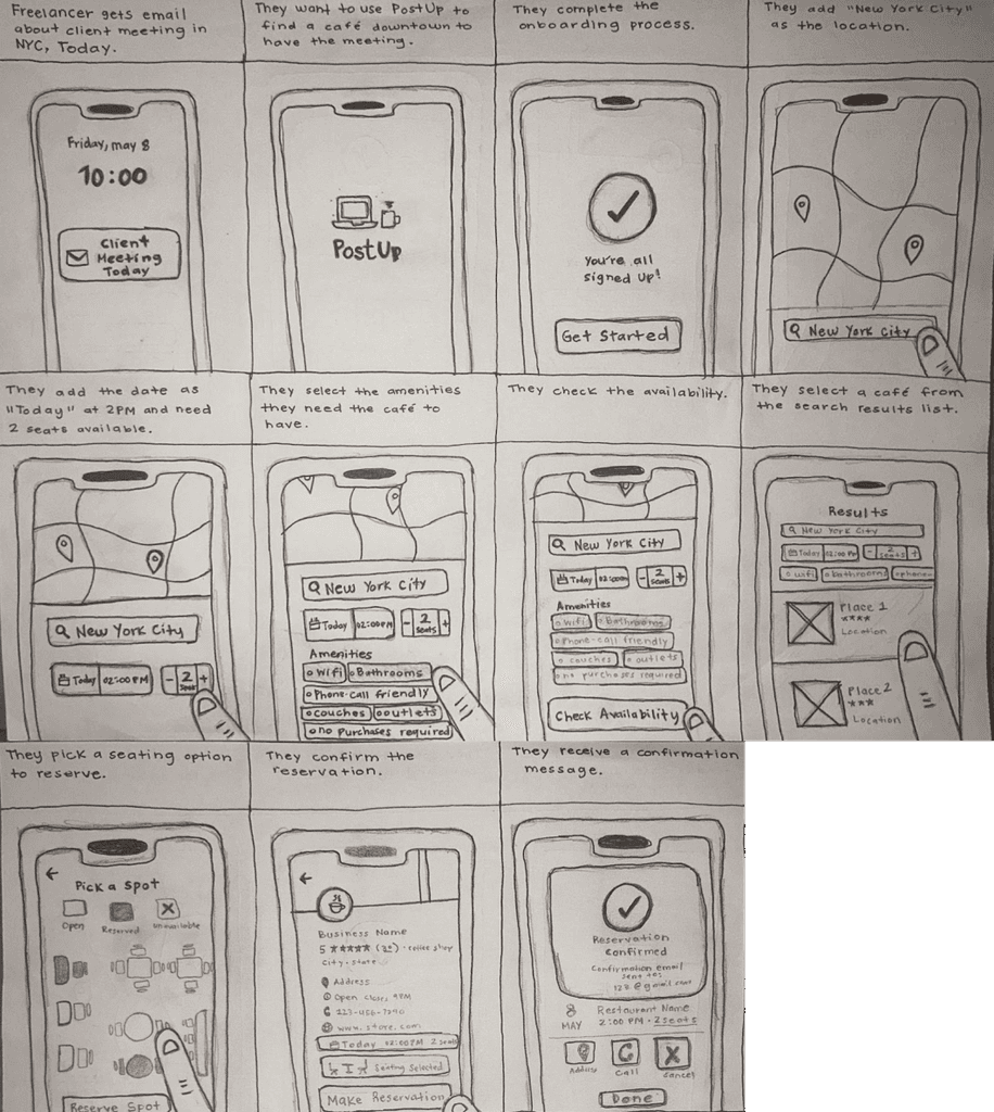
Storyboard
To begin exploring the user flow for the app, I designed a storyboard showcasing how a freelancer could search and reserve seats in a New York City cafe for them and their client for that afternoon.
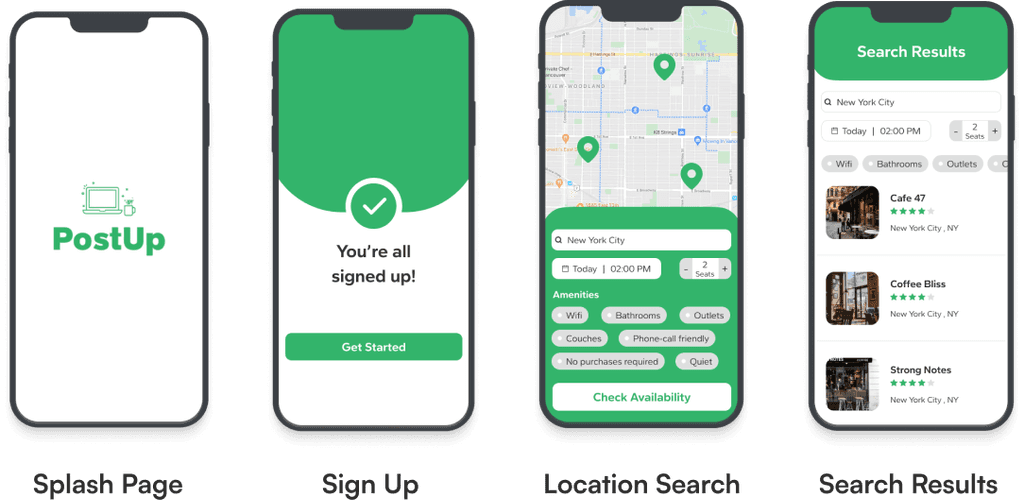
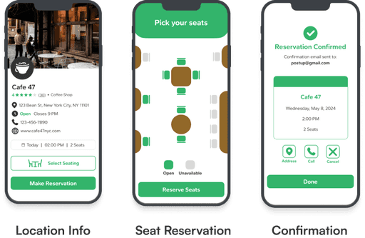
Day 4: Prototype
Day 5: Test
Conducting Usability Tests
On Day 5 of the design sprint, I conducted 5 interviews with 5 different participants in person and online over Zoom.
My testing goals were to:
• See the effectiveness of the seating feature
• Compare with Google’s or Yelp’s efficiency
• Learn how to make the flow as simple as possible
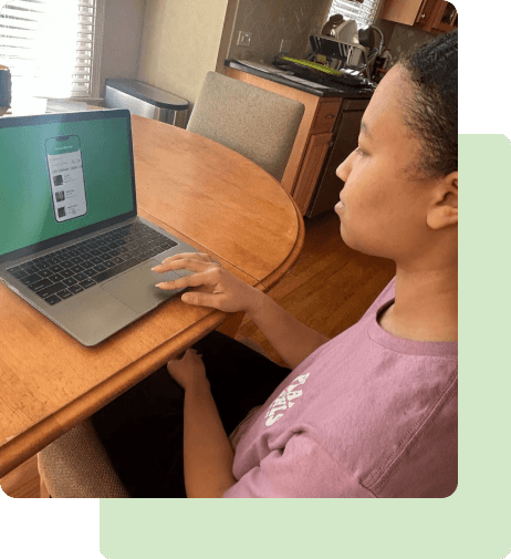
Select the amenities they would like in a public workspace
Choose a public workspace from the search results
Choose their seating arrangements and book the reservation.
What I found:
More Pictures
Give users a better feel of a location’s seating set-up
More Amenities
Accessibility for handicap, cubicles, whiteboards, etc.
Clarify Star Rating
Specify which ratings are for a location’s work setup
In Conclusion
Plan in advance
I learned the importance of planning in advance, as I had to reach out in the beginning of the week to ensure my usability testing participants would be willing and available by Day 5.
Learning experience
Even though this was a solo project, I also had the ability to get glimpses as to what a design sprint looks like for a full design team and took lots of notes and inspirations through senior UX designers’ work and shared resources on design sprints.
If I did it all again…
I would’ve taken more time to develop the map screen of the prototype. It was the most difficult screen for me to create and if I were to start this process over again, I would’ve built that screen in more depth and added more features related to a location’s distance to the user.
Thank you for reading!
