Savery Mobile App

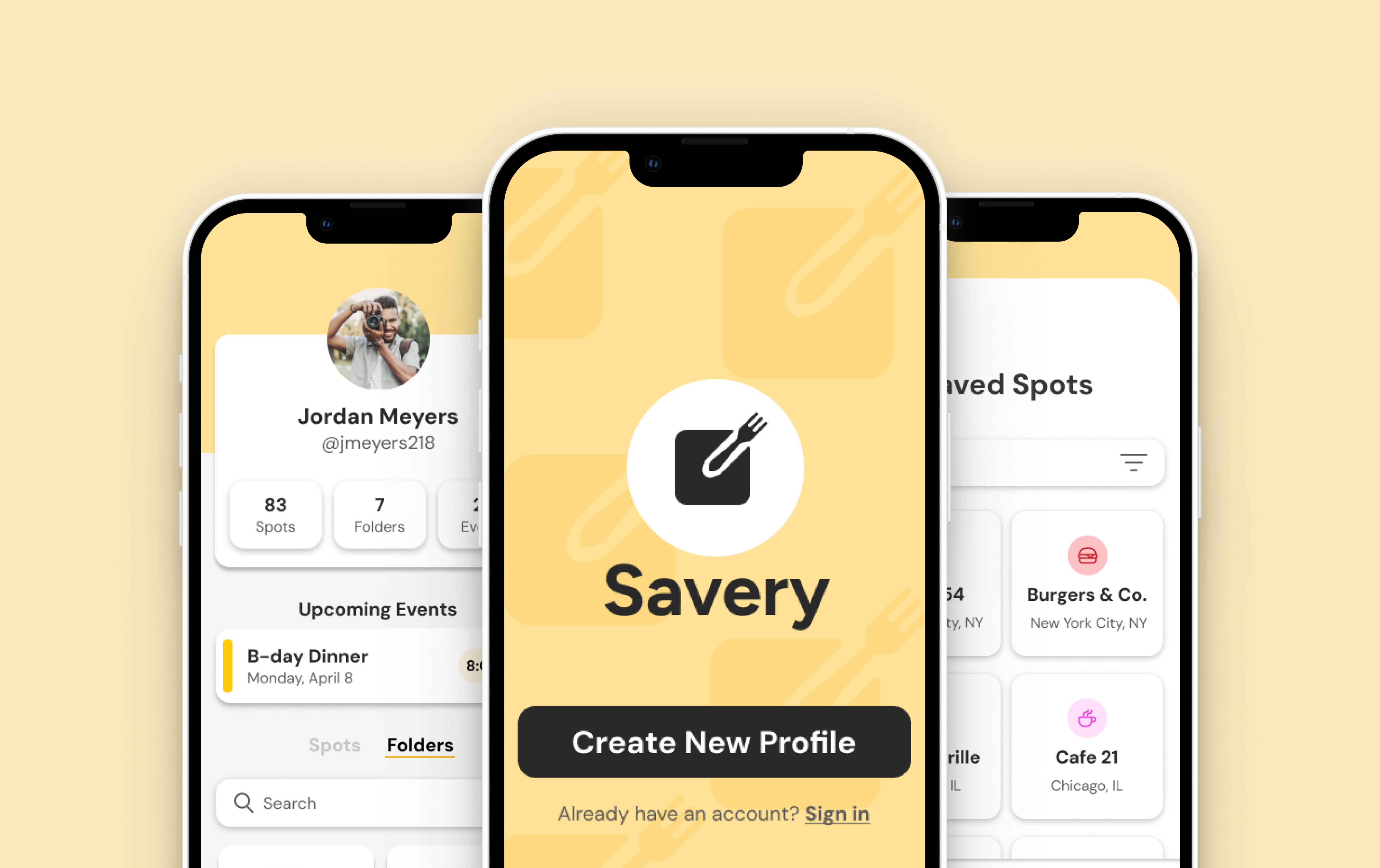
Savery, a play on the words “savory” and “save”,  is a mobile app designed to help users record, store, retrieve, and schedule information from any restaurant of their choice and have it all saved under their own unique profile.

Savery, a play on the words “savory” and “save”,  is a mobile app designed to help users record, store, retrieve, and schedule information from any restaurant of their choice and have it all saved under their own unique profile.

Savery, a play on the words “savory” and “save”,  is a mobile app designed to help users record, store, retrieve, and schedule information from any restaurant of their choice and have it all saved under their own unique profile.

Team

Me: Solo UX/UI Designer

Tools

App Screen with open sidebar

Savery was created over a 5-month period where I:

Conducted usability tests, industry research, and competitor analysis

Conducted usability tests, industry research, and competitor analysis

Conducted usability tests, industry research, and competitor analysis

Developed a research plan and participant screener survey

Developed a research plan and participant screener survey

Developed a research plan and participant screener survey

Synthesized research through personas, flows, and maps

Synthesized research through personas, flows, and maps

Synthesized research through personas, flows, and maps

Produced sketches, sitemaps, wireflows, and wireframes

Produced sketches, sitemaps, wireflows, and wireframes

Produced sketches, sitemaps, wireflows, and wireframes

Produced sketches, sitemaps, wireflows, and wireframes

Curated app branding and style guide


Curated app branding and style guide


Curated app branding and style guide


Designed high-fidelity prototype


Designed high-fidelity prototype


Designed high-fidelity prototype


The Problem

People are always being exposed to new eateries and often have their saved places to eat stored in a plethora of different places: Pinterest boards, notes apps, spreadsheets, etc.

These restaurants often get scattered or even forgotten about as time goes on and before they even get to try them.

People are always being exposed to new eateries and often have their saved places to eat stored in a plethora of different places: Pinterest boards, notes apps, spreadsheets, etc.

These restaurants often get scattered or even forgotten about as time goes on and before they even get to try them.

People are always being exposed to new eateries and often have their saved places to eat stored in a plethora of different places: Pinterest boards, notes apps, spreadsheets, etc.

These restaurants often get scattered or even forgotten about as time goes on and before they even get to try them.

How might we make the ability of saving desired eating experiences organized, concise, and easy to access and retrieve?

The Research

Exploring the Problem

Exploring the Problem

Exploring the Problem

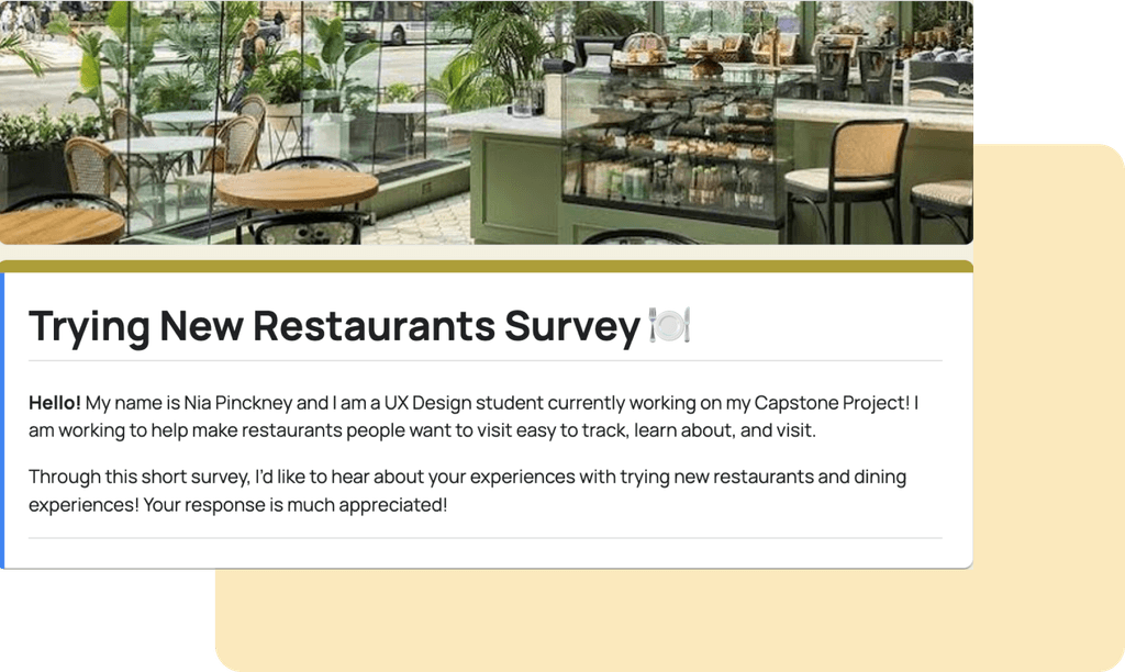
To further explore the behaviors, motivations, and pain points of keeping track of new restaurants, I created a 6 question screener survey and sent it to 28 participants.

What I found:

What I found:

What I found:

Media’s Influential

79% of participants found new restaurants through Google, TikTok, or Instagram.

Notes App on Top

43% of participants use their phone's notes app to save new restaurant information

Organization

Participants desired to save restaurants in folders and by cuisine and location

Interviewing the Audience

I then spoke directly with 4 participants from my screener survey to learn in depth about their experiences with trying new restaurants, saving restaurant information, and inspirations for finding new places to eat.

Research Synthesis

Organizing the Findings

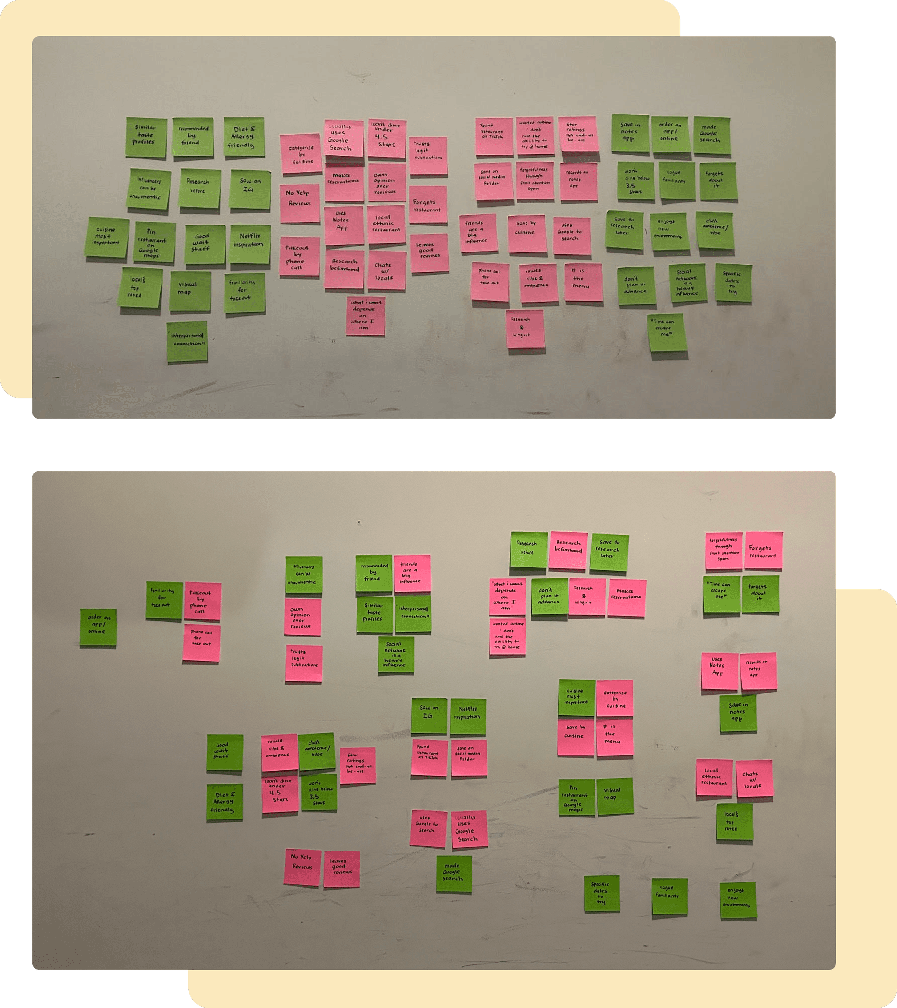
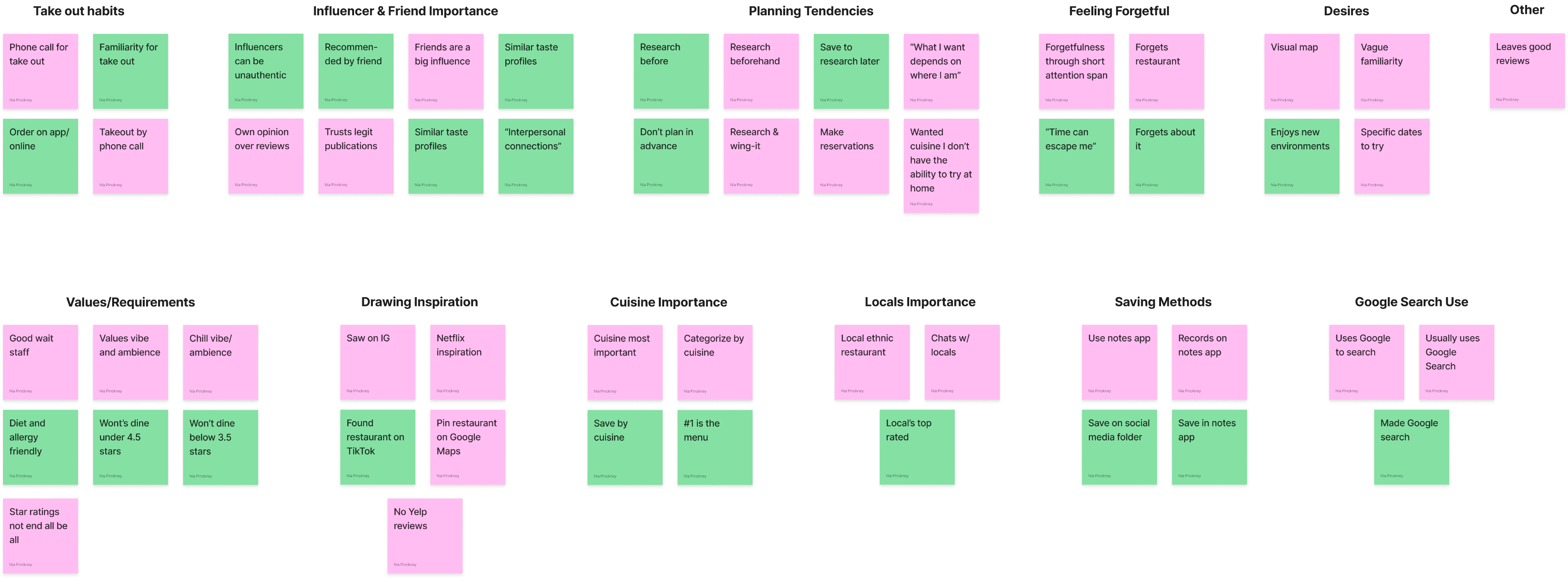
To begin analyzing the notes taken from my user interviews, I created an affinity map and was able to organize all information into 12 categories.

What I found:

What I found:

What I found:

Forgetfulness

Participants mentioned forgetting where they had stored restaurant information.

Folder Search

Participants wanted to search through folders instead of having to scroll through them.

Organization

100% of participants save a restaurant’s cuisine and location

"It's just social media in general. It's not just TikTok.
I find stuff everywhere."

- Participant #2
-

Identifying the Personas

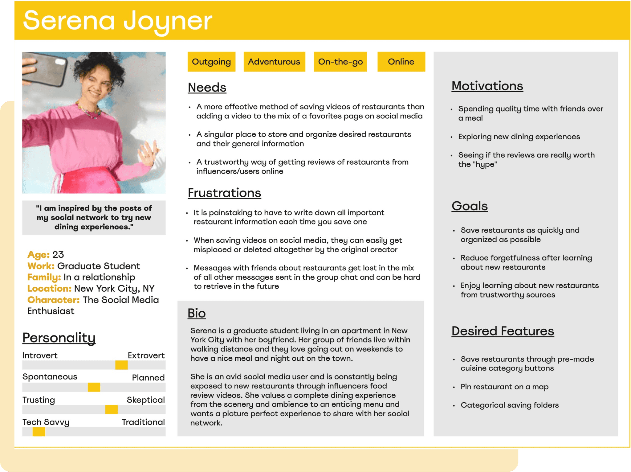
The notes from my interviews assisted me in creating 3 user personas that represented my diverse target audience:

• Media Enthusiast

Serena finds new restaurants through a variety of media platforms and desires to save restaurants as quickly and organized as possible.

Go With the Flow-er

Sophisticated Diner

• Media Enthusiast

Serena finds new restaurants through a variety of media platforms and desires to save restaurants as quickly and organized as possible.

Go With the Flow-er

Sophisticated Diner

• Media Enthusiast

Serena finds new restaurants through a variety of media platforms and desires to save restaurants as quickly and organized as possible.

Go With the Flow-er

Sophisticated Diner

Creating the Information Architecture

Creating the Information Architecture

Creating the Information Architecture

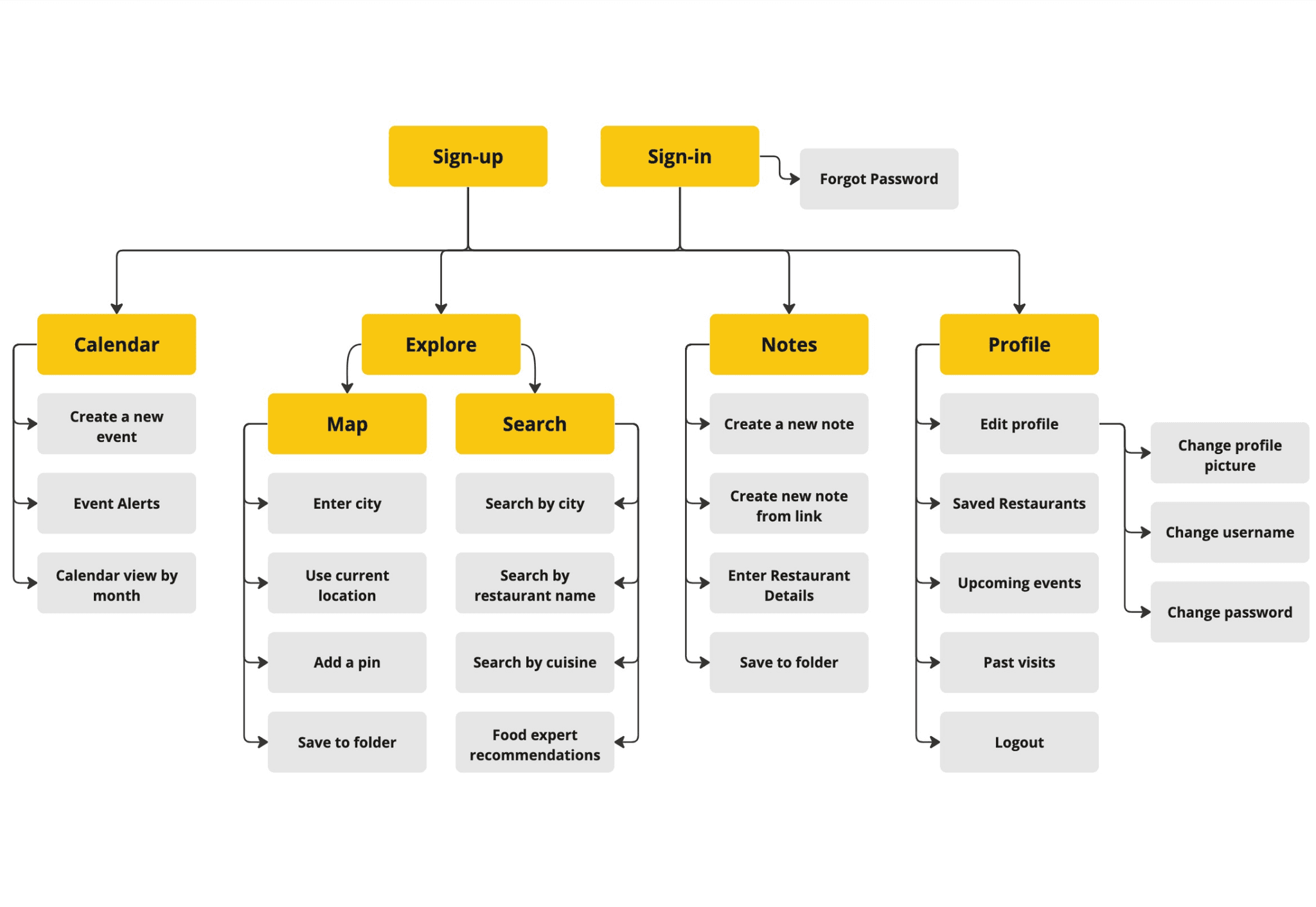
As I was certain a mobile app would be the best way to provide a solution for my user personas, I created an app sitemap to structure the navigation between all the pages included in the app.


Along with screens for an onboarding process, I designed the mobile app to have 4 main screens:


• Calendar

• Explore

• Notes

• Profile

The Design Phase

Creating the Mobile App Sketches

Creating the Mobile App Sketches

Creating the Mobile App Sketches

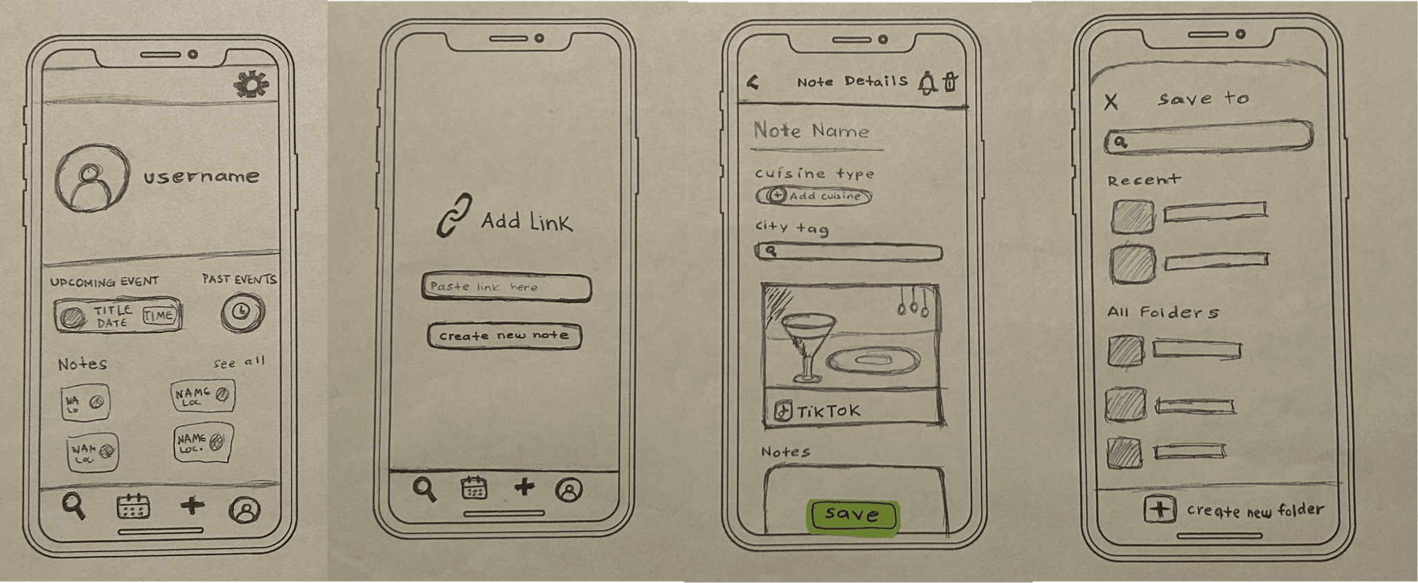
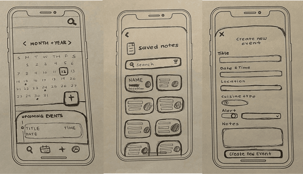
Keeping in mind my user’s pain points, desires, and motivations it was then time to get a pencil and paper and start visualizing what the screens would look like on a mobile device.

Version 1

Version 2

Version 1

Version 2

Version 1

Version 2

Determining the User Flows

Determining the User Flows

Determining the User Flows

I then identified 3 red routes showcasing the ways in which my user personas would carry out 3 key tasks within the app.

Red Route #1

Red Route #2

Red Route #3

Onboarding

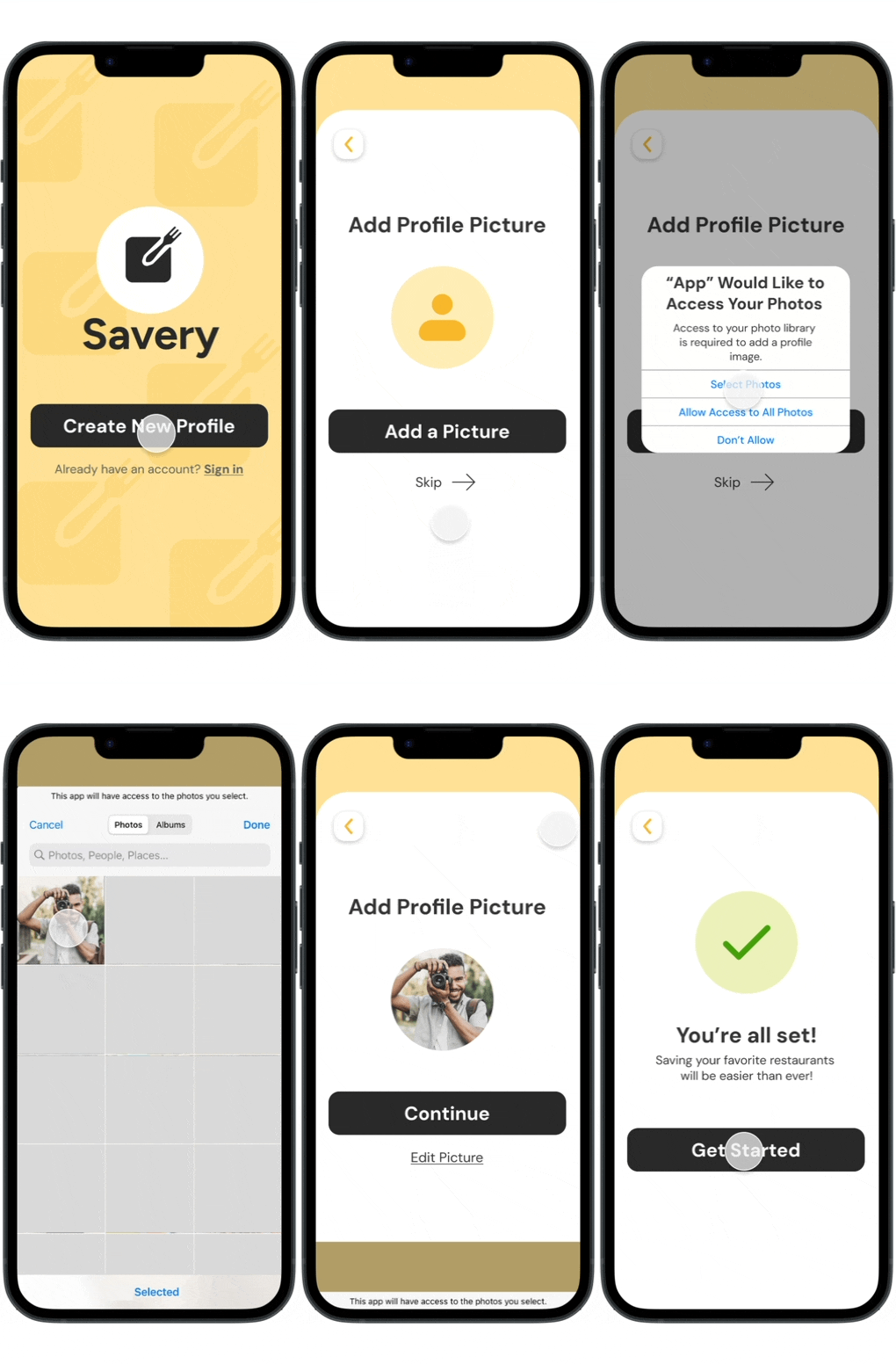
The flow for a new user who has recently downloaded the mobile app and is setting up a new profile.

Red Route #1

Red Route #2

Red Route #3

Onboarding

The flow for a new user who has recently downloaded the mobile app and is setting up a new profile.

Route #1

Route #2

Route #3

Onboarding

The flow for a new user who has recently downloaded the mobile app and is setting up a new profile.

Creating the Brand Identity

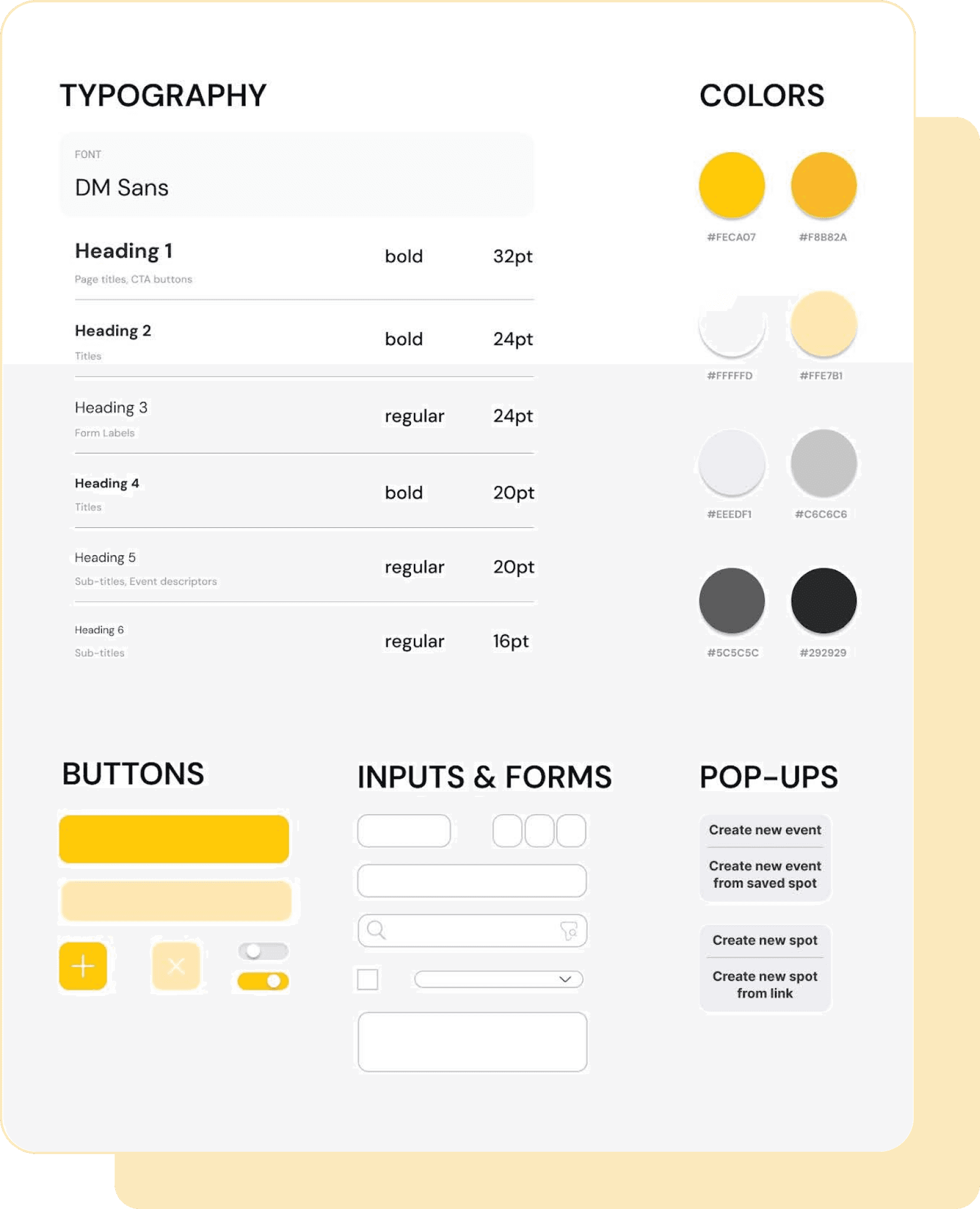
When deciding on the main color for the mobile app, I chose yellow as is the color associated with both food and memory,
both central themes of my app.

When deciding on the main color for the mobile app, I chose yellow as is the color associated with both food and memory, both central themes of my app.

When deciding on the main color for the mobile app, I chose yellow as is the color associated with both food and memory, both central themes of my app.

The Final Prototype

ONBOARDING

EMBED MEDIA

CREATE EVENTS

ONBOARDING

EMBED MEDIA

CREATE EVENTS

ONBOARDING

EMBED MEDIA

CREATE EVENTS

The Final Test

Running the Usability Testing

The final usability test took place across 2 rounds with 7 total participants, where I made design changes based on feedback in between each testing session.


My testing goals were goals were to:


• Uncover usability problems in my created red routes


• Gather opinions on the color scheme


• Gather any additional feedback that would contribute to a better user experience

Participants were assigned to complete 3 tasks:

Participants were assigned to complete
3 tasks:

Participants were assigned to complete
3 tasks:

Start your Savery journey by creating a new profile for yourself.

Create a new spot for the restaurant Bistro 54 using the TikTok link you have copied.

Schedule an event for visiting your saved spot Burgers & Co. on April 3rd, 2024 at 8:00PM.

Future Iterations Based On Findings:

Remove Username

Since there are no friend adding features, I can remove the username feature.

Add Tooltips

Adding tooltips after the onboarding process would be beneficial for first-time users.

Larger Target Area

Some users had trouble selecting cuisine types due to a small target area.

Learning Moments

Problem > Solution

I automatically assumed a mobile app would be what I would create even before I had begun testing to really see what users would most benefit from. I was grateful for my mentor throughout this process as she helped me to stay focused on the problem.

Think of all possibilities

When creating my prototype, I left out the possibility that my test participants may not think to complete tasks in the same ways that I do and learned to create multiple ways to complete a certain task.

When in doubt, ask your users

There were many times throughout the process where I had questions about what I was creating and learned that the best way to answer these questions that arose is to ask the people who matter the most: your users.

Thank you for reading!